
Home decoration, the color is very particular about the mix, with the right words, you can cover up the defects of the house, so that the overall decoration style shows perfect results, on the contrary, if not properly matched, it will not only undermine the beauty of space, but also affect the people Mood and health. Then how to match the color of home decoration? In fact, the color is very simple, as long as these laws are mastered, you can decorate your home with both color and not cumbersome.
First, home decoration color collocation law
1, color should not be too miscellaneous
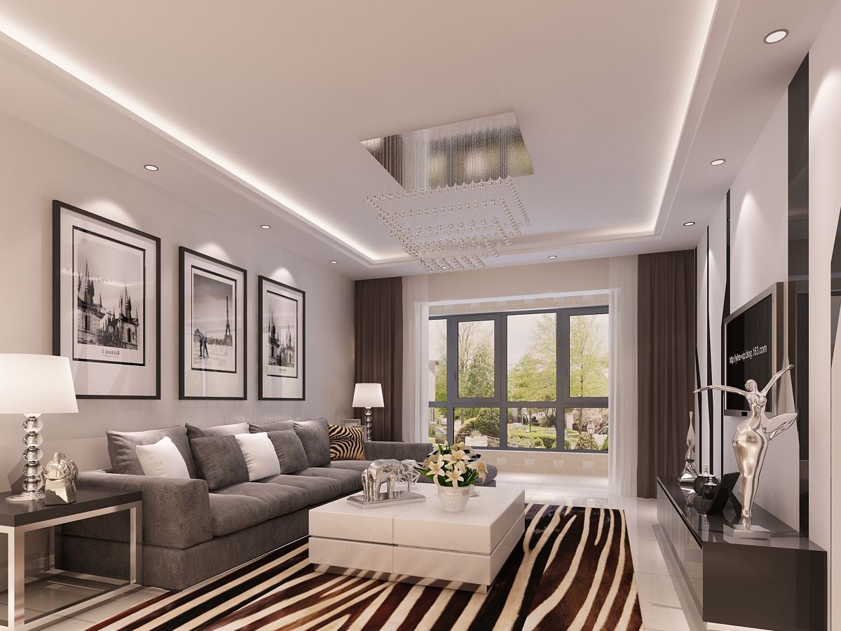
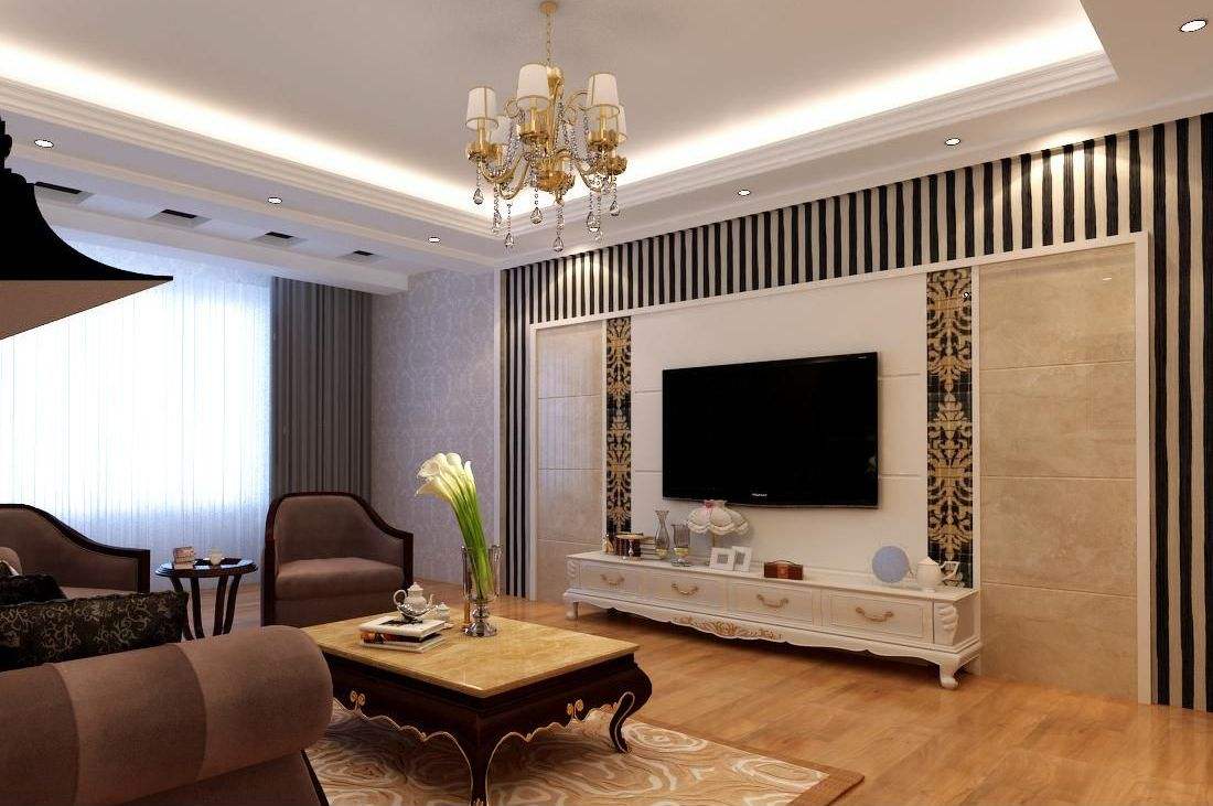
The overall pursuit of color harmony, as far as possible in the same space can not exceed three colors, of course, the basic color, that is, white, black, gray is not calculated within the limits of the three colors.
2, mood and color
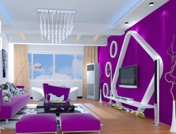
Color can affect the owner's mood. When decorating a large area of ​​color, pay special attention. For example, the large use of purple, pink, and black can make people feel depressed, irritated, and stuffy. The massive use of red and gold can increase the burden on the eyes.
3, with the overall space is harmonious
The color matching of the decoration needs to consider whether it is in harmony with other indoor relationships. Factors such as space function, overall style, size of space, and orientation of the house type need to be considered.
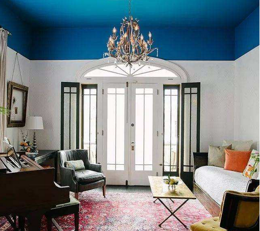
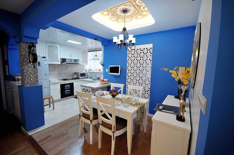
4, the color of the ceiling
It is better to be lighter than or the same color as the wall. When the color of the wall is dark, the color of the ceiling is preferably white or the same color as the wall. If you use too dark colors, it will make the entire room feel oppressive. For example, the following figure, the blue ceiling makes people feel top-heavy.
Second, home decoration with 8 colors used with caution
1. Do not decorate the restaurant with blue
Blue has the function of regulating nerves and calming nerves. But blue light makes food look unattractive. Therefore, it is not suitable for use in restaurants or kitchens. Do not use incandescent lamps or blue mood lights in the restaurant. If you change to warm colors, people will look more appetizing and romantic.
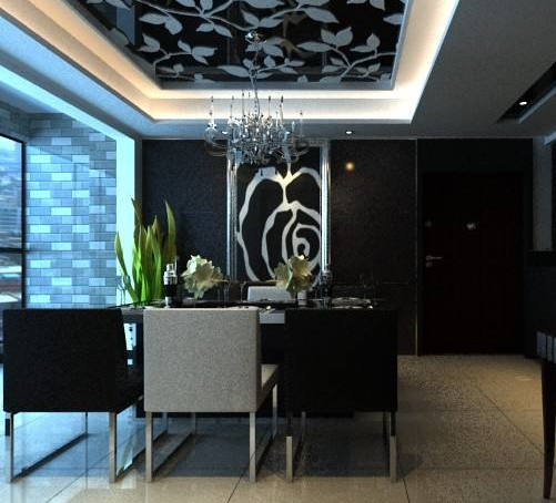
2. Black and white equal ratio
Black and white, modern, full of choice for fashionistas. However, if the room is black and white with a large area of ​​use, it will be fancy, long time dazzling, nervous, irritable. Therefore, it is best to use white as the main part, with other colors interspersed, the space becomes bright, and both taste and taste.
3. Purple will give a sense of space suppression
Purple, giving people an infinite romantic association, full of mystery. However, the use of a large area of ​​purple can create a sense of depression. Especially when you are in a room or a children's room, it can make you feel depressed for a long time. If you really like it, you can use it as a decorative highlight in your home, such as: the corner of the bedroom, the drapes in the bathroom, etc.

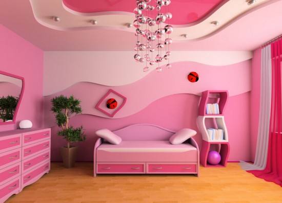
4. Pink will give people annoying emotions
Pink, it looks sweet and romantic. However, if a large area of ​​heavy pink is used, it will make people feel excited. Over time, it will easily affect family harmony. It is advisable to embellish the pink or dilute the color to make the room warm.
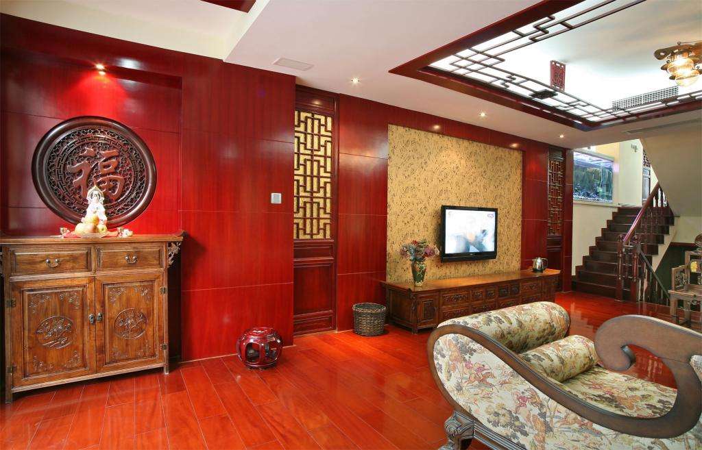
5. Red can't be a main color space for a long time
Red is very auspicious, but too much red can make people feel dizzy. It is recommended to use on soft outfits such as bedding, bags, trinkets, etc.
Editor's summary: The above brings home decoration collocation laws and hopes to help those who have this need! For more information, please continue to pay attention to our website, follow-up will show more exciting content!
Home Decoration
High Quality Cheap Price Outdoor Solar Powered Garden Lamp 100 LED Waterproof Motion Sensor Solar Wall Garden Lights
Outdoor Solar Powered Garden Lamp ,Cheaper Price Solar Wall Lights,Solar Wall Garden Lights,Motion Sensor Solar Garden Lights
Shenzhen You&My Electronic Technology Co., Ltd , https://www.ymledtrade.com